
Dark kitchen cabinets tend to make an entrance. Charcoal, deep navy, forest green, or dark timber kitchen cabinets—these colours don’t whisper. They anchor a space. They feel deliberate. Modern, yes, but also confident in a way lighter kitchens rarely are.
And then comes the next decision: What goes on the wall?
Because with dark cabinets, the splashback isn’t just a background surface anymore. It’s doing real work. Get it right, and the kitchen feels layered, calm, and considered. Get it wrong, and suddenly everything feels heavy, closed, and a bit too serious.
In Australian homes, especially where kitchens often open straight into living areas, and daylight can change dramatically from one house to the next, that balance really matters. So let’s talk contrast and how to use it without fighting your cabinets.
Why Contrast Matters in Dark Kitchen Designs
Dark cabinetry absorbs light. That’s part of its appeal. It adds depth and drama. But without contrast, the space can lose clarity. Edges blur. The kitchen starts to feel closed in, especially during evening hours.
A well-chosen splashback steps in here. It introduces light, reflection, or texture at eye level—exactly where the room needs a visual pause. Think of it as a pause between the weight of the cabinets and the busyness of the benchtop.
And in open-plan Australian homes, this contrast becomes even more important. The kitchen doesn’t exist in isolation. It needs to hold its own while still flowing naturally into adjacent living areas.
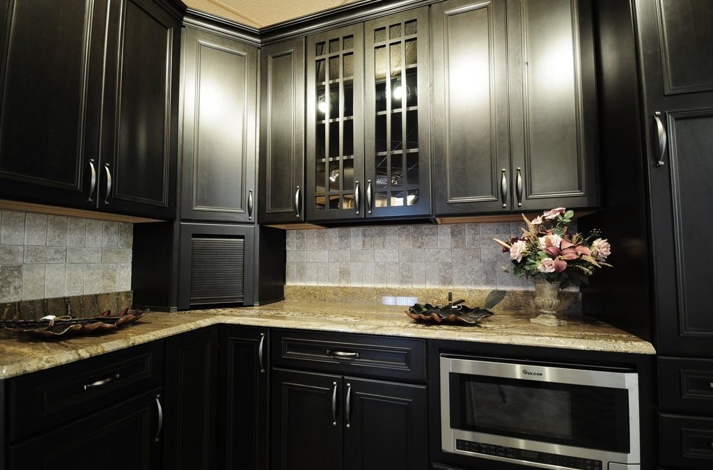
Light Stone: The Ideal Splashback for Black Kitchen Cabinets
Light stone is often the first option people consider when pairing a splashback for dark cabinets and light countertops. And for good reason.
Marble, quartz, and porcelain slabs in soft whites, gentle greys, or creamy tones lift the space almost instantly. They create contrast without feeling sharp or overly decorative. The cabinetry still does the talking; the splashback just adds clarity behind it.
This approach works especially well if your kitchen has:
- Limited natural light
- Dark floors or benchtops
- Long runs of tall cabinetry.
A full-height stone splashback can also visually stretch the wall upward. Small detail, big difference. And in kitchens that see real daily use (not just Instagram moments), stone earns extra points for being practical. It’s easy to clean, heat-resistant, and durable over time.
White Isn’t Just—White
“White” splashbacks rarely behave the same way across different kitchens.
While navigating splashback colours for kitchen spaces, it’s important to know that cool whites can feel stark against warm charcoal or timber-toned cabinets. On the other hand, warm whites, bone shades, and soft off-whites tend to integrate more naturally, especially in Australian interiors that favour warmth over clinical contrast.
Undertones matter. A hint of beige or grey can soften the transition between dark cabinetry and benchtops, avoiding that stark, cut-out look. It’s subtle on a sample tile. Much less subtle once it covers an entire wall.
This is one of those details that doesn’t feel dramatic at first—until you see the finished kitchen.
Glass Splashbacks: Clean, Bright, and Reflective
Glass offers a different type of contrast. Not texture. Reflection.
A pale glass splashback behind dark cabinets can bounce light back into the room, which is a huge advantage in kitchens with smaller windows or southern exposure. Even a warm off-white or soft grey glass panel can lift the space without pulling attention away from the cabinetry.
Another bonus? No grout lines. No visual clutter. That uninterrupted surface works beautifully with handleless cabinets and sleek, architectural designs.
That said, glass can feel flat if everything else is too smooth. So, pair it with stone benchtops, timber accents, or matte cabinet finishes to bring some depth back in.
Texture as Contrast (Without Going Lighter)
Contrast doesn’t have to mean pale colours. Sometimes, texture does the heavy lifting.
Tiles with subtle relief—handmade ceramics, softly rippled finishes, slim vertical tiles—create shadow and movement that offset dark cabinets beautifully. Even mid-tone tiles can stand their ground if the surface has enough variation.
Vertical stacking deserves a special mention. It pulls the eye upward and counteracts the horizontal weight that dark base cabinets can create. A small design choice, but a smart one.
If warmth and character matter to you, textured tiles often feel more lived-in than slab materials. Less showroom. More home.
When Dark-on-Dark Actually Works
Yes, a dark splashback for a black kitchen can work. Sometimes incredibly well.
In larger kitchens with excellent lighting, deep stone or richly toned tiles create a cocoon-like feel—moody, refined, very intentional. It’s bold. And it’s not for everyone. But it’s memorable. However, the key is balance. Light benchtops, reflective hardware, or strong natural light are non-negotiable here. Without them, dark-on-dark kitchens can feel compressed, especially in standard-sized Australian homes.
This is a look that rewards careful planning and precise execution.
Lighting Changes Everything
A splashback that looks perfect at midday can feel flat—or heavy—at night if lighting isn’t considered early.
Under-cabinet lighting is essential with dark cabinetry. It highlights the splashback surface, adds depth, and keeps the workspace functional after dark. In fact, more than 68% of new kitchen designs now include under-cabinet lighting, largely because darker finishes demand it.
How Splashbacks Relate to Benchtops and Cabinet Finishes
The splashback doesn’t live in isolation. It sits between two strong personalities: cabinets and benchtops.
With dark cabinets and light benchtops, the splashback often works best as a bridge—matching the benchtop material or echoing its tone to keep things cohesive.
When both cabinets and benchtops run dark, the splashback becomes the main source of relief. Lighter materials or reflective finishes usually make the space feel more balanced.
Matte cabinetry pairs well with honed stone, textured tiles, or satin glass. Gloss cabinets, on the other hand, often look best with simpler splashbacks that don’t compete for attention.
Common Missteps Worth Avoiding
Even with the best intentions, it’s easy to fall into a few common design traps when pairing splashbacks with dark cabinetry. Here is what to watch out for:
- Choosing a splashback too close in tone to the cabinetry, so the wall disappears.
- Using stark white without considering undertones.
- Treating lighting as an afterthought,
- Layering too many textures in one small space.
Perhaps most importantly: forgetting the big picture. When the splashback doesn’t connect the cabinets to the benchtop, the kitchen can feel like three separate ideas forced into one room.
A Thoughtful Finish Makes All the Difference
At Krauss Kitchens, splashbacks are never an afterthought. We know well that cabinet finishes, benchtops, and splashback materials often change the decision entirely.
So, if you’re ready to bring light and shade into balance in your kitchen renovation, get in touch with Krauss Kitchens today. Book a design consultation or visit our showroom to explore options in person—because the right contrast doesn’t just look good. It changes how the space feels every single day.